
 @
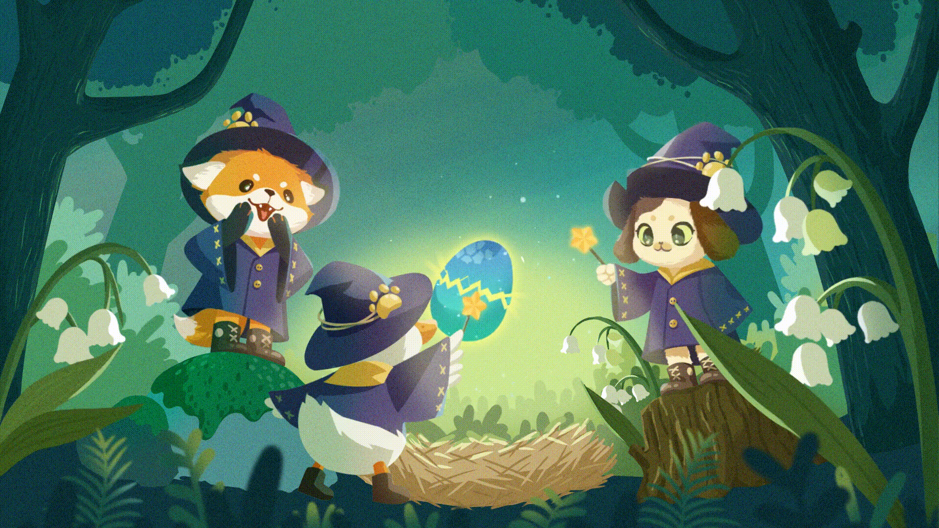
@RT Konstantin Denerz
Create a CSS-based holographic card ✨ using this simple trick from my @CodePen.
✅ Mask-Image 🎭
✅ Linear-Gradient 🌈
🔗 https://codepen.io/konstantindenerz/pen/XWPpvpg
Inspiration: https://twitter.com/drawsgood/status/1630570176037961733
#css #animation #csstrick #holocard https://t.co/PY95qOibLJ
<div class="rsshub-quote">
Drawsgood: Throwback Tuesday to this holographic card made in @rive_app
Check it out in the community here: https://rive.app/community/3515-7963-holo-card/ https://t.co/TbYlSjouVs
</div> https://twitter.com/kdenerz/status/1641179695298523136
RT Chris Gannon
Page Rotator @CodePen https://codepen.io/chrisgannon/pen/WNgWBRp @greensock (watch out for a special Easter edition coming soon!) #interactive #javascript #animation https://t.co/DKyiVRtJYr
RT jhey 🔨🐻✨
CSS Tip! 🤙
You could use CSS :has() to power a context-aware custom cursor experience 👆
:root:has(.player:hover) {--active: 1;}
.cursor {scale: var(--active);}
:root:has(.player:hover > [aria-label="Pause"])
.cursor-pause-icon {
display: block;
}
@CodePen link below! 👇 https://t.co/ntfuo0iiWq
RT Bence
Some color and pattern variants of squiggly neon🎨
Squiggly Neon 〰️ (326 bytes) #PetitePatterns on @CodePen
https://codepen.io/finnhvman/pen/RwYOLzK https://t.co/lAiqu8SZna
RT Karina Chow
I'm knee-deep in project planning, so going to revisit some projects in the past that might be interesting!
The first is a responsive animated triptych about sewing I made using NO JavaScript!
SVGs + CSS Animations
Spritemap
All CSS
See the CodePen:
https://codepen.io/karomancer/pen/yLNdeXE https://t.co/IDwPprp1W7
RT Juxtopposed
just made this design for the @CodePen play button challenge. been wanting to make this animation for a while now.
check it out on CodePen for a little surprise (it's not rickroll, I promise): https://codepen.io/Juxtopposed/pen/vYzPrbg
#CodePen #CodePenChallenge https://t.co/oPvF6KFlVJ
RT Matthias Hurrle
Reflections of Lullabies
To play a lullaby, press the button. Don't forget to turn on the 🔉 sound.
https://codepen.io/atzedent/pen/QWVPyLL via @CodePen
#codepenchallenge #webgl #shader #animation https://t.co/9C1uUWgROb
RT Adam Argyle
ya'll ready for this?
✅ in a cards "layer"
✅ when the user "prefers light" mode
✅ "scope" and trap the .card style
✅ "nest" within the scope to stay DRY
try in Canary with web experiments enabled
https://codepen.io/argyleink/pen/GRBMXyR https://t.co/v72OVTQag8
RT T. Afif @ CSS Challenges
💡 CSS Tip!
Use the new color-mix() to create different shades from one color.
Mix with ⚫️black for a darker color and ⚪️white for a lighter color
Demo: http://codepen.io/t_afif/pen/ExeMOPV via @CodePen
#CSS https://t.co/m5VP4QBP11
<div class="rsshub-quote">
T. Afif @ CSS Challenges: 💡 CSS Tip!
Use the new color-mix() function to create a color switch.
✅ No color duplication
✅ Define your colors using one variable
✅ Easy switch between colors
✅ Suitable for dark/light mode
Demo: http://codepen.io/t_afif/pen/XWPGWPp via @CodePen
#CSS https://t.co/4l9uyVXPds
</div> https://twitter.com/ChallengesCss/status/1640674024438083584
RT Konstantin Denerz
My next @CodePen shows a neumorphic temperature slider. The liquid animation is made with CSS clip-path animation ✅.
🔗 https://codepen.io/konstantindenerz/pen/qBMvXNK
Inspiration: https://twitter.com/realvjy/status/1640342553563217920
#css #animation #liquid #slider #temperatureslider https://t.co/vV1tOJe9Aj
<div class="rsshub-quote">
vijay verma: Over the weekend, I started learning SwiftUI. After spending some time to learn the basics, with the help of ChatGPT and of GLSL coding knowledge, I created my very first app. More info and source code shared below 🧶 https://t.co/GwHldLdChr
</div> https://twitter.com/kdenerz/status/1640487672371085313
RT jhey 🔨🐻✨
CSS Tip! 🤙
Need to pack things into empty gaps with CSS grid?
Use this 👇
grid-auto-flow: dense;
Perfect candidate for this 3D Mondrian built with @reactjs && @greensock 🤓
@CodePen link below! 👇 https://t.co/dEuBD1BpCo
RT Amit Sheen
Dual Picture Accordion Fold 🖼️🪗🖼️
- View changes as you hover across the screen
- #CSS only
Live demo on @CodePen: https://codepen.io/amit_sheen/full/PodVLMr https://t.co/0TdueL1YTS
RT Chris Gannon
🧻Toilet Paper Toggle is the interactive version of The Correct Way by @Mr_Bingo
Artwork: https://shop.mr.bingo/products/the-correct-way-1
Interactive animation: https://codepen.io/chrisgannon/pen/mdGvGjJ
@CodePen @greensock
😀 https://t.co/lU6djfQ9eD
It's the final week of the Buttons #CodePenChallenge!
This week, let's play! We're focusing on "play" buttons ▶️
https://codepen.io/challenges/2023/March/4 https://t.co/487Z7WT1ut
RT jhey 🔨🐻✨
CSS Tip! ✨
How do you animate these particles? 👀
Use transform-origin!😎
.particle {transform-origin:var(--ox) var(--oy);}
.particle:first-of-type {--ox:1000%;--oy: 800%;}
keyframes float {to {rotate: 360deg;}}
Button concept from @edoardomercati 👏
@CodePen link below! 👇 https://t.co/Dj5mNEDCxJ
RT Yohei
Hahaha, "coding" is so much fun w #GPT4.
Just for fun - Made a "Clingy Button" that jiggles as you get close, then clings to your mouse when it gets closer.
Do you think this would increase conversion rate? 🤪
Codepen: https://codepen.io/yoheinakajima/pen/jOvQMdQ https://t.co/yX0c22bIgs
https://twitter.com/yoheinakajima/status/1638624817871224834
RT T. Afif @ CSS Challenges
An expanding gallery for this week #CodePenChallenge
🌟 A CSS-only version with minimal code
Demo: http://codepen.io/t_afif/full/JjaebpJ via @CodePen
#CSS https://t.co/LQfr5WqXmB
https://twitter.com/ChallengesCss/status/1638646319026786305
RT Aaron Iker
✨ Button Hover Animation (HTML, CSS, JS)
Code / Demo @CodePen https://cdpn.io/gOdBBKq
Concept by @edoardomercati
Created using @greensock https://t.co/ewDseF1Dna
RT Matthias Hurrle
Creek
Procedural noise this time creates the impression of flowing water of a small creek. Turn on the sound 🔉 and dive in. https://codepen.io/atzedent/pen/yLxRzeL via @CodePen #codepenchallenge #webgl #shader https://t.co/TkCuaNVvqM
Bot
Build, test, and discover front-end code 👩🏽💻
Joined Dec 2020