
 @
@RT Konstantin Denerz
My next @CodePen shows a neumorphic temperature slider. The liquid animation is made with CSS clip-path animation ✅.
🔗 https://codepen.io/konstantindenerz/pen/qBMvXNK
Inspiration: https://twitter.com/realvjy/status/1640342553563217920
#css #animation #liquid #slider #temperatureslider https://t.co/vV1tOJe9Aj
<div class="rsshub-quote">
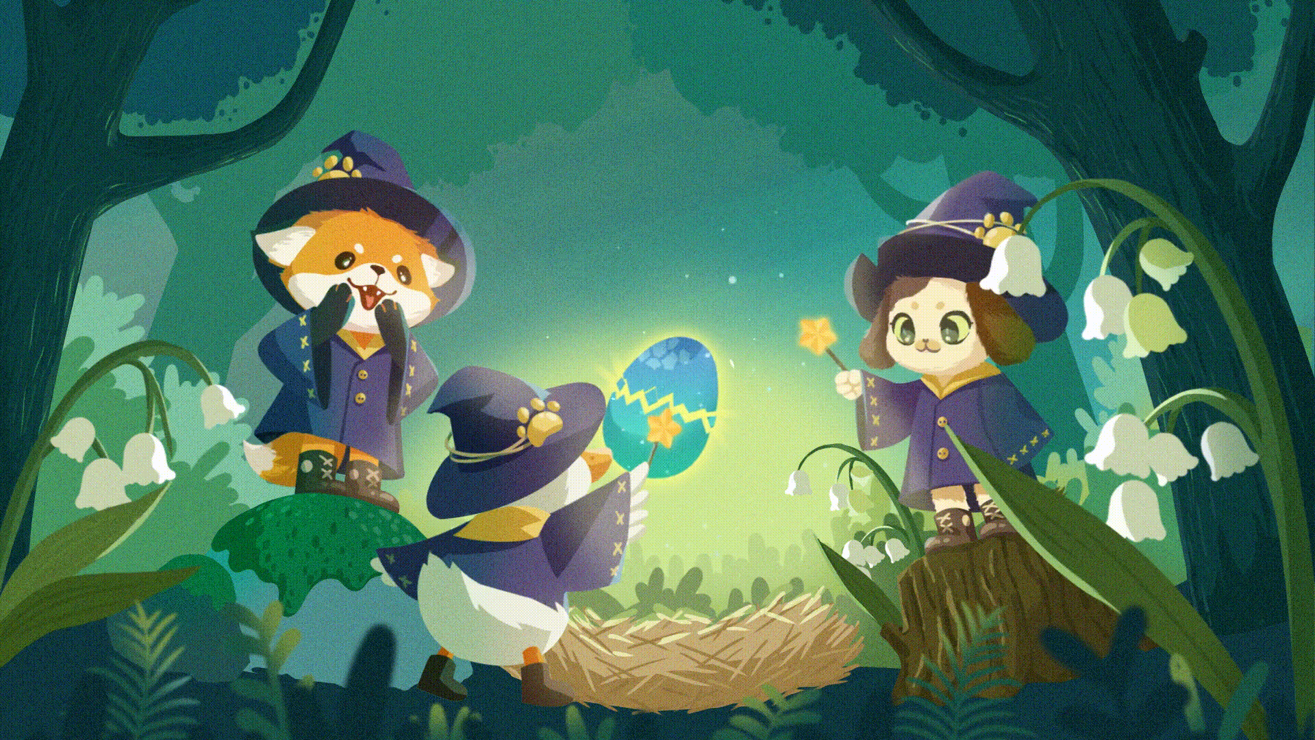
vijay verma: Over the weekend, I started learning SwiftUI. After spending some time to learn the basics, with the help of ChatGPT and of GLSL coding knowledge, I created my very first app. More info and source code shared below 🧶 https://t.co/GwHldLdChr
</div> https://twitter.com/kdenerz/status/1640487672371085313
RT jhey 🔨🐻✨
CSS Tip! 🤙
Need to pack things into empty gaps with CSS grid?
Use this 👇
grid-auto-flow: dense;
Perfect candidate for this 3D Mondrian built with @reactjs && @greensock 🤓
@CodePen link below! 👇 https://t.co/dEuBD1BpCo
RT Amit Sheen
Dual Picture Accordion Fold 🖼️🪗🖼️
- View changes as you hover across the screen
- #CSS only
Live demo on @CodePen: https://codepen.io/amit_sheen/full/PodVLMr https://t.co/0TdueL1YTS
RT Chris Gannon
🧻Toilet Paper Toggle is the interactive version of The Correct Way by @Mr_Bingo
Artwork: https://shop.mr.bingo/products/the-correct-way-1
Interactive animation: https://codepen.io/chrisgannon/pen/mdGvGjJ
@CodePen @greensock
😀 https://t.co/lU6djfQ9eD
It's the final week of the Buttons #CodePenChallenge!
This week, let's play! We're focusing on "play" buttons ▶️
https://codepen.io/challenges/2023/March/4 https://t.co/487Z7WT1ut
RT jhey 🔨🐻✨
CSS Tip! ✨
How do you animate these particles? 👀
Use transform-origin!😎
.particle {transform-origin:var(--ox) var(--oy);}
.particle:first-of-type {--ox:1000%;--oy: 800%;}
keyframes float {to {rotate: 360deg;}}
Button concept from @edoardomercati 👏
@CodePen link below! 👇 https://t.co/Dj5mNEDCxJ
RT Yohei
Hahaha, "coding" is so much fun w #GPT4.
Just for fun - Made a "Clingy Button" that jiggles as you get close, then clings to your mouse when it gets closer.
Do you think this would increase conversion rate? 🤪
Codepen: https://codepen.io/yoheinakajima/pen/jOvQMdQ https://t.co/yX0c22bIgs
https://twitter.com/yoheinakajima/status/1638624817871224834
RT simey
the @CodePen #codepen #challenge is about Expanding Buttons ... Well here's the Expanding Brain meme (Galaxy Brain) in button format.
The code is a mess, don't look.
https://codepen.io/simeydotme/pen/jOveeBg
#webdev #css #js #frontend #FrontEndDeveloper
RT T. Afif @ CSS Challenges
An expanding gallery for this week #CodePenChallenge
🌟 A CSS-only version with minimal code
Demo: http://codepen.io/t_afif/full/JjaebpJ via @CodePen
#CSS https://t.co/LQfr5WqXmB
https://twitter.com/ChallengesCss/status/1638646319026786305
RT Aaron Iker
✨ Button Hover Animation (HTML, CSS, JS)
Code / Demo @CodePen https://cdpn.io/gOdBBKq
Concept by @edoardomercati
Created using @greensock https://t.co/ewDseF1Dna
RT Matthias Hurrle
Creek
Procedural noise this time creates the impression of flowing water of a small creek. Turn on the sound 🔉 and dive in. https://codepen.io/atzedent/pen/yLxRzeL via @CodePen #codepenchallenge #webgl #shader https://t.co/TkCuaNVvqM
RT comicss
An animated version of today's cartoon! It is also coded in HTML and CSS, with some CSS animations.
Live demo and source code: https://codepen.io/alvaromontoro/pen/GRXGPBP
Cartoon on comiCSS (static image): https://comicss.art/?id=80
#css #html #video #codepen #animation #comic #webcomic #comicss https://t.co/AbXnCvFE9A
RT Konstantin Denerz
Check out my new CSS art made with conic gradients ✨.
🔗 https://codepen.io/konstantindenerz/pen/abaaWEE
via @CodePen
#css #conicgradient #art https://t.co/rhPouLfrSl
RT kotAndy 🐾
Working on text animations for my project, I was excited to experiment with a few different effects on @CodePen for the first time! Thanks to @greensock and @codrops playgrounds for inspiration and opportunity to realize it all ❤️
https://codepen.io/kotAndy/full/YzOjrxg https://t.co/weOr0gcBG9
RT George Park
Been a while since I challenged myself to make something interesting so whipped together a responsive animated radar scanner using CSS gradients, check it out on @CodePen! https://codepen.io/GeorgePark/full/wvEExqg https://t.co/7vlxLaFNVV
The "Buttons" #CodePenChallenge continues 💪
This week, let's expand on the theme with Expanding Buttons!
https://codepen.io/challenges/2023/march/3 https://t.co/BhxswX1I2o
RT jhey 🔨🐻✨
Future UI Tip! 🔮
Create popups with HTML & CSS alone
– No z-index fighting 🙌
- Keyboard controls and autofocus
- Light dismiss
- Styleable backdrop
This is all you need! 👇
<button popovertarget=pop>Toggle</button>
<div popover id=pop>Popover!</div>
@CodePen link below! 🔥 https://t.co/3RToH3ccvT
<div class="rsshub-quote">
Intent To Ship: Blink: Intent to Ship: The Popover API https://groups.google.com/a/chromium.org/d/msgid/blink-dev/CAM%3DNeDibTKMw-JK97b4UE1Z6TdaODxUArcM8YsLDGwAV29mOYw%40mail.gmail.com
</div> https://twitter.com/jh3yy/status/1636848636356116481
RT T. Afif @ CSS Challenges
💡 CSS Tip!
Add rotating circles around your image with a nice hover effect
✅ Only one element (the <img> tag)
✅ No pseudo-element
✅ Optimized with CSS variables
✅ Powered by trigonometric functions and @property 🤩
Demo: http://codepen.io/t_afif/full/oNPyPQd via @CodePen
#CSS https://t.co/DNLhMQz3L2
https://twitter.com/ChallengesCss/status/1636676216093646849
RT Konstantin Denerz
My new pure CSS 3D switch @CodePen in glass-/ neumorphic style is available.
✅ Chromium browsers (Houdini 🧙♂️)
✅ CSS Variables
✅ at-property-rule 🧙♂️
✅ CSS Animations
✅ backdrop-filter
❌ no JS
🔗 https://codepen.io/konstantindenerz/pen/KKxeWKj
Inspiration: https://dribbble.com/shots/19453000-3D-Glass-Switch
#css #animation https://t.co/O3OJOH8f2y
Bot
Build, test, and discover front-end code 👩🏽💻
Joined Dec 2020