
🆕
<angle>
DevTool
✨ in Canary now ✨
try out an early version today! 👍
A CSS component for quick visual access to angle direction. Thoughts!?
</angle>
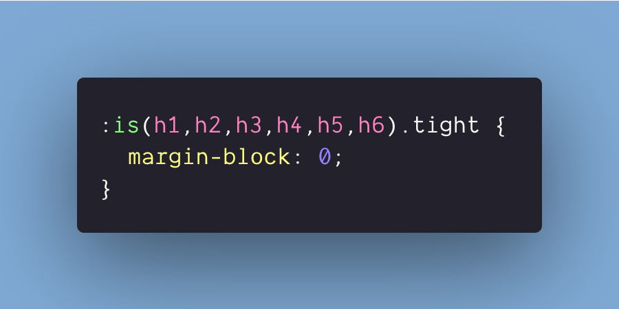
How slick :is(this CSS!?) 😏
removes the margins on all headers with a `.tight` class
h1.tight, h2.tight....... 🤢
:is(h1,h2).tight { 🤓 }
text-decoration-thickness: from-font;
text-underline-offset: .5ex;
.. headed for Chromium 87 🎉
will catch Chromium up with Safari & Firefox! Woot!!
🆕 from-font
look to the font for the font designer’s defined thickness or position, NOT the browser’s default
Intent To Ship: Blink: Intent to Ship: text-decoration-thickness, text-underline-offset and from-font keyword for text-underline-position
https://groups.google.com/a/chromium.org/d/msg/blink-dev/9OzS90KISXI/q5KYyyWBCAAJ
Here it is: cube candy twist
Live on @CodePen
Detailed explanation on how to CSS a cube with modern techniques in this @css article
Ana Tudor 🐯: I’ve just recorded a video. A bit different from all the videos I’ve recorded since I came back this summer in that it animates a pretty big number of elements in 3D.
The result looks really laggy on my system in the video. May not be on your device? Should I publish it anyway?
I’ve just realized that you can become an MVP @css Supporter.
You get no ads, extra content, easier commenting, and you directly support amazing people and a remarkably useful resource.
At $20/year, that’s a steal:
https://bit.ly/2EbGTBa
#CSS media queries conditionally apply styles, BUT did you know they can conditionally load styles too?
This tasty sip pairs well with a main course of CSS bundle splitting 👍
PostCSS 8.0 “President Ose” was released! Changes:
The main feature is the new plugin API. Migration guide:
https://github.com/postcss/postcss/releases/tag/8.0.0
https://evilmartians.com/chronicles/postcss-8-plugin-migration
SVG Daily Tip #17
By animating the viewBox of your SVG, you can create a camera effect 🎥
x & y, make the camera moves.
width & height, make the camera zoom.
Animation & source code:
#SVGTipOfTheDay#SVG
Louis Hoebregts: SVG Daily Tip #16
You can use JavaScript to know the length of an SVG path with the method getTotalLength.
Very useful for hand drawing animations✍️
Animation & source code:
#SVGTipOfTheDay#SVG
https://codepen.io/Mamboleoo/pen/QWNjdby
https://twitter.com/Mamboleoo/status/1292779801854582786
.logo {
display: flex;
place-items: center;
gap: .5ch;
font-size: 20vmin;
}
.logo > img {
max-block-size: 1.25em;
}
🤩 logo img height is 125% of a responsive font-size (20vmin) letter M.. relative units are so cool!
https://codepen.io/argyleink/pen/VwaQGxB
Proportional Resizing with CSS Variables by @shadeed9
.rect {
–size: 186px;
–aspect-ratio: 2.35;
width: var(–size);
height: calc(var(–size) / var(–aspect-ratio));
}
https://ishadeed.com/snippet/proportional-resizing-css-variables/
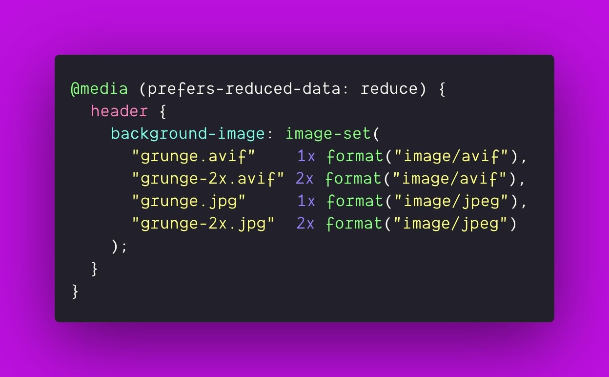
I’m excited for CSS to help distribute AVIF images! Here’s some demo code that follows current spec drafts:
- if in data saver / lite mode
- match first format supported
- match first resolution supported
- make that image the background
image-set() spec
Jake Archibald: 📝 AVIF has landed!
⬇️ Here’s how to use it today, and how it performs vs other web image formats.
https://jakearchibald.com/2020/avif-has-landed/
A new collection of CSS Gradients: Lens Flare! Colorful linear gradients with radial gradients stacked on top to give a “lens flare” effect:
https://www.gradientmagic.com/collection/lensflare
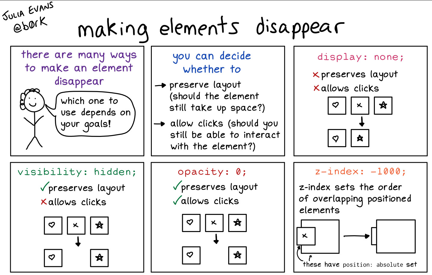
making elements disappear with CSS
permalink:
https://wizardzines.com/comics/css-hiding/
I’m working on a Web site that has an RTL version. This is where#CSS logical properties truly shine as they make styling both LTR & RTL possible using the same declarations. Fewer overrides & overall less code.🙌🏻
Demo:
More info:
https://codepen.io/SaraSoueidan/pen/3703b343f35edff2954b7b3d03485e61?editors=1100
https://www.smashingmagazine.com/2018/03/understanding-logical-properties-values/
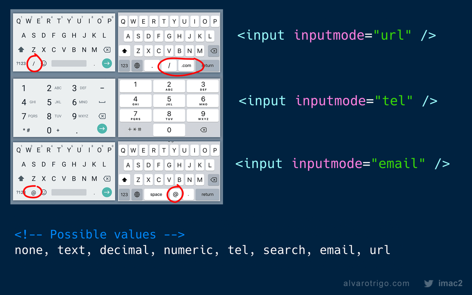
Today I discovered “inputmode”! 🥳
Now we can “hint” the browser what virtual keyboard we want to show on mobile devices without forcing the browser to change the visuals of the input. (unlike with input=”number” for example)
See me code: boximation with Houdini magic ✨🎩🐇
Live demo on @CodePen:
Extra resource: What Houdini Means for Animating Transforms
Enjoy!
https://www.patreon.com/posts/boximation-with-40617896
https://codepen.io/thebabydino/pen/MmabEw?editors=0100
https://css-tricks.com/what-houdini-means-for-animating-transforms/
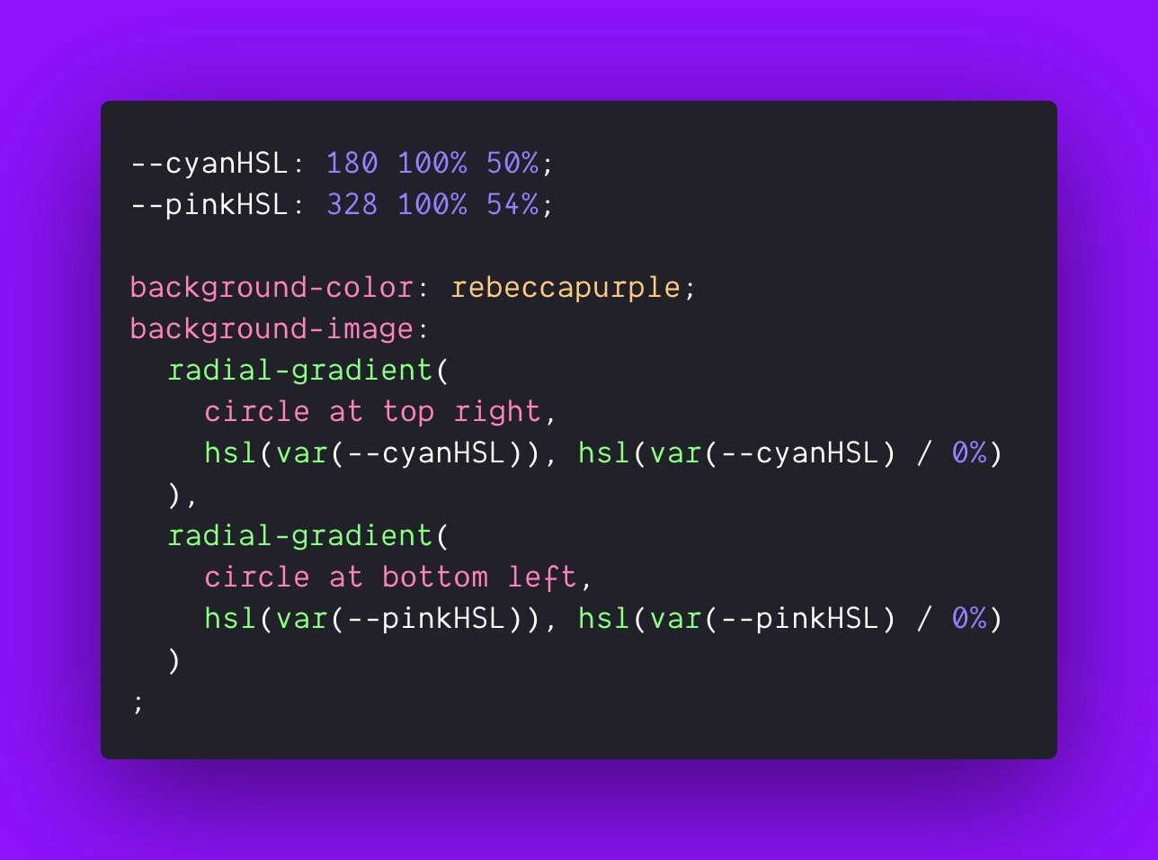
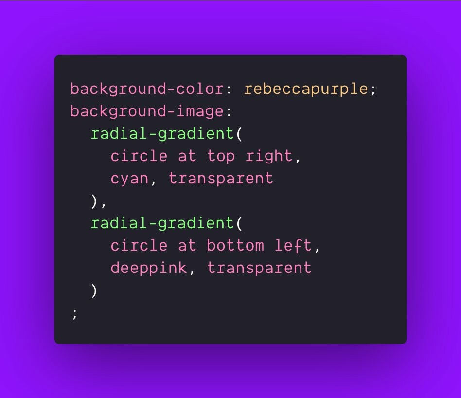
Opposing corner radial gradients look softer than angled linear gradients:
#CSS
background-image:
radial-gradient(
circle at top right,
cyan, transparent
),
radial-gradient(
circle at bottom left,
deeppink, transparent
)
;
play
https://codepen.io/argyleink/pen/ExKyMeZ